Contents


Ecommerce continues to be one of the fastest-growing industries globally, with more and more consumers turning to online shopping for everyday needs.
However, with increasing competition, it can be challenging to understand how to increase ecommerce sales.
Online sales are projected to grow 10.4% in 2023, totaling $6.3 trillion. Businesses must continuously adapt and implement proven strategies to stay ahead of the competition.
In this guide, we'll discuss 21 effective ways to boost ecommerce sales that you can start implementing today.

How can I increase online sales in 2024?
Once you understand the key factors influencing online sales, it's time to implement strategies to improve them. Here are 21 proven ways to increase ecommerce sales.
- Improve ecommerce SEO
- Offer limited-time sales and promos
- Use high-quality product images
- Provide detailed product descriptions
- Showcase customer reviews
- Accept a variety of payment methods
- Streamline your checkout process
- Implement a live chat feature
- Ensure your website is mobile-friendly
- Answer frequently asked questions
- Offer free shipping
- Implement a simple return policy
- Send abandoned cart communications
- Highlight social proof
- Upsell and cross-sell products
- Start a loyalty program
- Implement personalization
- Improve site speed
- Build an email marketing strategy
- Advertise on social media
- Level up your pop-ups
1. Improve ecommerce SEO
Search engine optimization (SEO) drives over 900% more traffic than organic social media, while 68% of online activity begins with a search engine.
Improving SEO can significantly enhance ecommerce sales due to its ability to attract a larger audience to your online store and increase brand awareness. To kick-start that process, run a quick e-commerce SEO audit to spot technical issues, keyword gaps, or page-speed problems holding your store back.
When potential customers search for your products, your SEO-optimized site appears higher in their search results, making it more likely that they'll visit your store.
Additionally, a well-structured, SEO-optimized site provides a smoother user experience, making it easier for customers to find and purchase the products they want.
2. Offer limited-time sales or promotional offers
Limited-time sales or promotional offers create a sense of urgency, which can also increase online sales.
Offering products or services at discounted prices for a specific period encourages customers to make immediate purchases to avoid missing out on the deal.
This urgency compels quick decision-making, shortening the typical sales cycle and leading to a direct increase in sales.
Additionally, limited-time offers act as effective customer acquisition tools and marketing campaigns. These sales and promotions attract bargain hunters and new visitors who may not have found your store otherwise.
3. Use high-quality product images
High-quality product images can significantly boost ecommerce sales, operating as one of the most potent tools in your online selling arsenal.
They give customers a more accurate representation of your products. This representation, in turn, helps bridge the gap between the online and physical retail experience, where customers can't touch or try items.
On ecommerce sites, the product image is often the first thing a customer notices. A clear, detailed, and visually appealing image can instantly grab customers' attention, encouraging them to explore the product further.
High-quality images build trust in your products and your brand. Blurry, small, or misleading images can make your site seem less professional and reliable. In contrast, large, detailed images reassure customers about the quality of the product and your brand's overall credibility.
4. Provide detailed product descriptions
Providing detailed product descriptions can significantly enhance ecommerce sales by giving customers a comprehensive understanding of a product's features, benefits, and usage.
When you outline features, specifications, and benefits, customers can better assess whether the product meets their needs and preferences. This clarity can foster confidence in purchase decisions, leading to increased sales.
Plus, ecommerce companies that use relevant keywords and phrases in their descriptions can improve their store's visibility on search engines when potential customers search for similar products. Increased online visibility can drive more traffic to their site and generate sales.
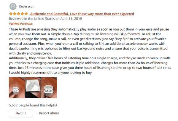
5. Showcase customer reviews
Showcasing customer reviews on your ecommerce site can significantly enhance website sales by fostering trust, providing social proof, and increasing customer engagement.
Customer reviews build trust and credibility. Consumers tend to trust their peers more than a brand’s marketing messages. Therefore, displaying positive reviews from satisfied customers can reassure potential buyers about the quality and value of your products, increasing their likelihood of purchasing.
Reviews also enhance customer engagement. Encouraging customers to leave reviews provides valuable feedback for your business and makes the customers feel valued and part of a community. This engagement can lead to more customer loyalty and higher repeat purchase rates.
If you’re not sure how to get more reviews, consider the following:
- Asking your family and friends.
- Leveling up customer service.
- Sending review requests to new customers.
- Launching a user generated content (UGC) program.
- Sending product samples or packages to influencers with instructions on how to review.
- Replying to customer reviews, even if they appear on third-party sites.
6. Accept a variety of payment options
Accepting various payment options can significantly increase ecommerce sales by enhancing customer convenience and reducing cart abandonment.
Having multiple payment options caters to customer preferences and enhances their shopping experience. Not all customers pay the same way. Some may prefer credit or debit cards, while others opt for online payment platforms like PayPal, Google Pay, or Apple Pay.
Accommodating various payment methods can help you reach a larger, more global audience. For instance, buyers widely use credit cards in the United States. But alternative methods like eWallets or bank transfers might be more prevalent in other countries.
By providing these options, you can cater to a global audience, expanding your customer base and boosting your sales.
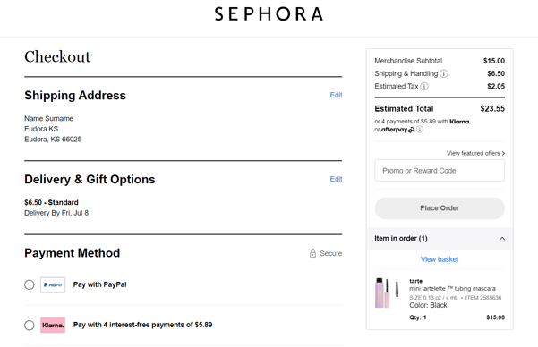
7. Streamline your checkout process
A simplified checkout process is a proven tactic that reduces customers' time and effort in purchasing. This increase in efficiency can lead to higher conversions, as customers are less likely to abandon their carts due to a lengthy or complicated checkout process.
Minimizing the number of steps in the checkout process can reduce buyers' opportunities to change their minds or get distracted and leave your site. For instance, allowing customers to checkout as guests, rather than requiring them to create an account, can expedite the process and prevent potential customers from leaving.
Online sellers should provide clear, concise information at each step of the checkout process, such as the total cost, including tax and shipping. Unexpected costs are a common reason for cart abandonment, so transparency in pricing can prevent such surprises and ensure customers complete their purchases.
8. Implement a live chat feature
Live chat offers immediate assistance to customers, resolving their queries or problems in real time. A quick response can prevent cart abandonment caused by confusion or issues during shopping, ultimately leading to higher conversion rates.
Live chat can also provide a more personalized experience. Customer service representatives can use live chat to recommend products based on a customer's needs or preferences, leading to increased sales.
This personal touch can enhance customer satisfaction and loyalty, potentially leading to repeat purchases.
You can also use live chat as a powerful lead-generation tool. By engaging with website visitors, you can collect contact information and gain insights about their needs or interests. You can use this information in follow-up marketing efforts, such as email campaigns, which can help you get sales.
9. Ensure your website is mobile-friendly
Mobile-friendly websites provide a seamless shopping experience on smaller screens, making it easy for customers to browse products, read descriptions, and make purchases.
As a result, this increases customer satisfaction, leading to higher conversion rates and repeat purchases.
Mobile-friendly websites load faster on mobile devices. Faster load times reduce the chance of customers leaving out of frustration, increasing the likelihood of a purchase.
Mobile-friendliness can enhance your website's visibility in search results. Search engines like Google prioritize mobile-friendly websites in their rankings, and a higher ranking can drive more traffic to your site, resulting in more potential sales.
10. Answer frequently asked questions
A frequently asked questions (FAQ) page is a convenient resource for customers to find answers to common questions about your products or services, shipping policies, return procedures, and more.
By quickly resolving these queries, you can reduce the hesitation or confusion that might otherwise prevent customers from making a purchase.
A fine-tuned FAQ page can serve as an extension of your product descriptions, offering further details and use cases that can help customers understand the value of your products. This comprehensive information can build customer confidence in the product's suitability for their needs, potentially driving more sales.
By incorporating keywords and phrases that customers might use when searching for your products or services, you can improve your site's visibility in search results, driving more traffic to your site and thus increasing potential sales.
11. Offer free shipping
47% of online shoppers cite high shipping costs, taxes, and fees as reasons they abandon their carts during checkout. Free shipping is a powerful incentive for customers, reducing the overall cost of their purchase and making your products more attractive.
Customers are more likely to complete their purchase if they know you won't add more shipping charges to their final checkout price. As a result, you can reduce cart abandonment rates significantly.
Free shipping also encourages larger orders. Many ecommerce stores set a minimum order value to qualify for free shipping, prompting customers to add more items to their cart to reach the threshold.
This ecommerce strategy can effectively increase your average order value and overall sales revenue. In a crowded market, free shipping can be the deciding factor that separates your business from competitors who charge for delivery.
12. Implement a simple return policy
A straightforward and generous return policy builds trust between the business and the customer.
It signals that the company has confidence in the quality of its products and is willing to stand by them. This trust can make customers more comfortable making a purchase, especially when buying expensive or high-risk items.
A simple return policy reduces purchase hesitations for customers. Online shopping inherently carries an element of risk due to the lack of physical interaction with the product.
Knowing that they can easily return unsatisfactory products can encourage customers to take the plunge and make a purchase, increasing sales.
By making the return process easy and hassle-free, you show customers you value their convenience and satisfaction. This positive experience can lead to repeat purchases and positive word-of-mouth, which can increase ecommerce sales.
13. Send abandoned cart communications
70% of online shoppers abandon their carts before completing the checkout process, representing a significant loss of potential sales.
One effective way to recover these abandoned carts is by putting these buyers on an email list and sending follow-up communications about their unfinished purchases.
These gentle reminders can prompt customers to return to your online store and complete their transaction, thereby recovering a lost sale.
As part of your email strategy, these retargeting messages provide an opportunity to offer discounts or incentives that encourage the customer to purchase.
For example, offering a limited-time discount or free shipping might be the extra push a customer needs to complete their transaction. If you’re not sure what kinds of gifts or bonuses to share and when, consider the following:
|
What to offer:
|
When to offer it:
|
14. Highlight social proof
Social proof helps build trust and credibility for your brand. Customers tend to trust the opinions and experiences of other consumers more than they trust advertising from businesses.
By showcasing positive reviews, testimonials, and ratings, you validate your product quality and reliability, making potential customers more likely to make a purchase.
Customers often hesitate to buy products online due to the inability to examine the items physically. Highlighting positive customer experiences can alleviate these concerns, encouraging more customers to complete their purchases.
By featuring user-generated content such as customer photos or videos using your products, you can differentiate your products from competitors, making your offerings more appealing.
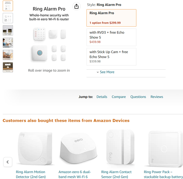
15. Upsell and cross-sell products
Upselling and cross-selling are powerful strategies that can significantly increase your ecommerce sales. Upselling is a sales technique that encourages customers to purchase a higher-end product or add-on to make the sale more profitable.
For instance, if a customer is looking at a basic model of a product, you can suggest a more advanced model with better features or durability.
Upselling improves profit margins and enhances the customer's experience by providing them with a product that better satisfies their needs. Moreover, it can increase customer lifetime value by promoting higher-priced items, increasing revenue in the long run.
Cross-selling, on the other hand, involves recommending related products that complement the customer's initial purchase. Cross-selling adds value to the customer's shopping experience by enhancing the product's usability.
Plus, it can grow ecommerce sales and order values, as customers are likely to buy more when they see products that accentuate their main purchase. Consider the following when determining when, how, and who to upsell or cross-sell products.
| Upsell or cross-sell product | Location | Timing | Medium |
| The latest discounted products | Home or landing page | First-time visit | Banner |
| Bestsellers | Product page | Repeat visit | Chatbot |
| Seasonal or location-specific products | Cart | At checkout or cart abandonment or another exit event | Pop-up |
| Items that compliment a customer’s purchase/cart items | Category page | After purchase | Email or push notification |
| Products from the same category | Search or results page | At add-to-cart event | Paid ad |
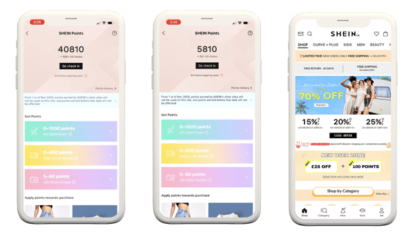
16. Start a loyalty program
Loyalty programs incentivize repeat purchases by providing rewards when new or existing customers buy or take action, like subscribing to your email list, posting reviews, or referring friends.
These rewards often take the form of points they can redeem for discounts, special deals, or exclusive products.
Loyalty programs support customer retention, as customers enrolled in a loyalty program are more likely to return to purchase again in exchange for potential rewards. Higher customer retention rates translate to a stable customer base and consistent sales.
These programs also enhance the average order value (AOV). Often, loyalty program members spend more per transaction than non-members due to incentives like greater rewards in higher tiers.
Lastly, loyalty programs can provide valuable customer data. By tracking loyalty members' purchases, you can gain insights into their preferences and habits. Use this information to optimize your product offerings and marketing strategies, potentially increasing conversion rates and sales.
17. Implement personalization
Personalization in ecommerce is a strategy that involves creating tailored shopping experiences based on individual customer data and behaviors. It can significantly increase ecommerce sales by boosting customer engagement, conversion rates, and loyalty.
Product recommendations are a vital aspect of personalization. By analyzing a customer's browsing history, past purchases, and search queries, you can recommend products that align with their preferences and needs.
This method can increase average order values and overall sales by promoting relevant products that the customer will likely purchase.
A personalized user experience in your ecommerce store can also drive sales. This personalization can involve customizing the website layout, navigation, and product sorting based on the customer's behavior.
For example, you might display the categories a particular customer frequently shops from at the top of your site. A user experience tailored to individual needs can increase customer satisfaction and encourage repeat purchases.
18. Optimize website speed
A fast-loading website provides a smooth, efficient user experience, which is crucial in ecommerce. Customers value their time and want to make purchases quickly and effortlessly.
Slow-loading pages diminish trust, cause friction in the experience, and can lead visitors to abandon their shopping carts or even leave your site altogether.
The quicker customers can move from browsing to checkout, the more likely they will complete a purchase. Therefore, optimizing your website speed is crucial in boosting ecommerce sales. And there are a few easy ways to do it.
- Reduce image file sizes: Large image files can slow website loading times. Compressing images without compromising quality can significantly improve site speed.
- Use caching: Caching your website's elements can improve site speed on repeat visits.
- Prioritize above-the-fold content: Above-the-fold refers to the part of a web page visitors can see without scrolling. Prioritizing this content's loading speed can give customers a sense of progress and encourage them to stay on your site.
Implementing these speed optimization techniques can improve customer satisfaction, increase conversion rates, and ultimately boost sales.
19. Build an email list and an email marketing strategy
Email marketing remains a powerful tool in the ecommerce landscape, playing a central role in nurturing customer relationships and driving sales.
Personalized promotions and offers are at the heart of successful email marketing. By segmenting your customer base and tailoring your messages, you can deliver relevant content and offers that resonate with individual customers.
As stated, abandoned cart reminders are a highly effective aspect of email marketing. By shedding light on items left in the shopping cart, these reminders prompt customers to complete their purchase and create an opportunity to offer additional incentives such as discounts or free shipping.
Newsletters provide a regular touchpoint between your brand and customers. By sharing relevant content, new product announcements, or special promotions, newsletters keep your brand at the forefront of the customer's mind, increasing the likelihood of future purchases.
20. Advertise on social media
Social media advertising is an indispensable tool in ecommerce marketing, offering a unique blend of reach, engagement, and conversion potential.
With millions of users worldwide, social media platforms like Facebook, Instagram, X, and LinkedIn provide an immense audience for your brand. Promoting your products on these platforms can significantly expand your customer base, leading to higher sales.
Targeted advertising allows businesses to tailor their ads to specific demographics, locations, interests, and behaviors. This ensures only people interested in your products see your ads, resulting in a higher conversion rate.
Customer engagement is another integral part of social media. Unlike traditional advertising mediums, social media facilitates two-way communication with your audience, allowing you to respond to their feedback and build relationships. This enhances customer loyalty and can lead to repeat purchases and increased sales.
Tracking and analytics, offered by most social media platforms, enable businesses to monitor ad performance and make data-driven decisions. Businesses can optimize their advertising strategies to maximize ROI by understanding what works and what doesn't.
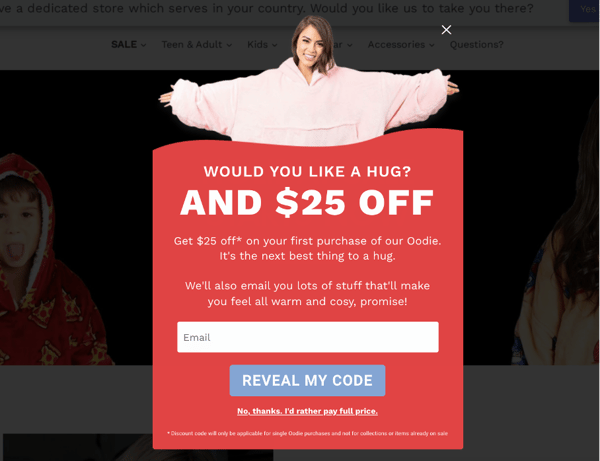
21. Level up your pop-ups
Pop-ups only work if you send them at the appropriate times. For example, visitors are likely to jump ship if you give them pop-ups before they have a chance to browse your store or display irrelevant or repeated pop-ups in one session.
Track your store visitors’ behavior to know who, when, and where they would be glad to see your message. Consider the following goals and rewards when strategizing your pop-ups.
| Goal | Offer | Audience | Timing | Location |
| Grow your email list | Bonuses and discounts | First-time visitors | A few minutes after the page visit or scroll | Home or landing page |
| Guide visitors to a relevant product | Free shipping | Customers who bought a product | Exit event | Product page |
| Grow sales | Value-add content | Repeat visitors | Button or link | Checkout |
| Get feedback | Relevant products | Those who abandoned checkout or carts | At checkout or cart abandonment | Cart |